Role: Designer, Research Assistant
Time: Fall 2018 - Fall 2019
Ex-Out: A digital handbook against hate
Ex-Out is a digital handbook that helps those looking to
make a difference to create and share their message, promote inclusion, and combat hatred and violence
online.
Society has been driven apart by media, technology, and misinformation. We may not know the solution, but
it definitely isn’t hatred or violence. Ex-Out looks to take the first step against extremism by
creating a community built on empathy, and a space that can support everyone.


The Ex-Out app
Not eveyone is a designer, social media expert, or confident in their ability to tell a story. It’s the
goal of the Ex-Out app to assist in these aspects for those wanting to share their message to spread
positivity, promote inclusion, share stories, and prevent acts of violence.
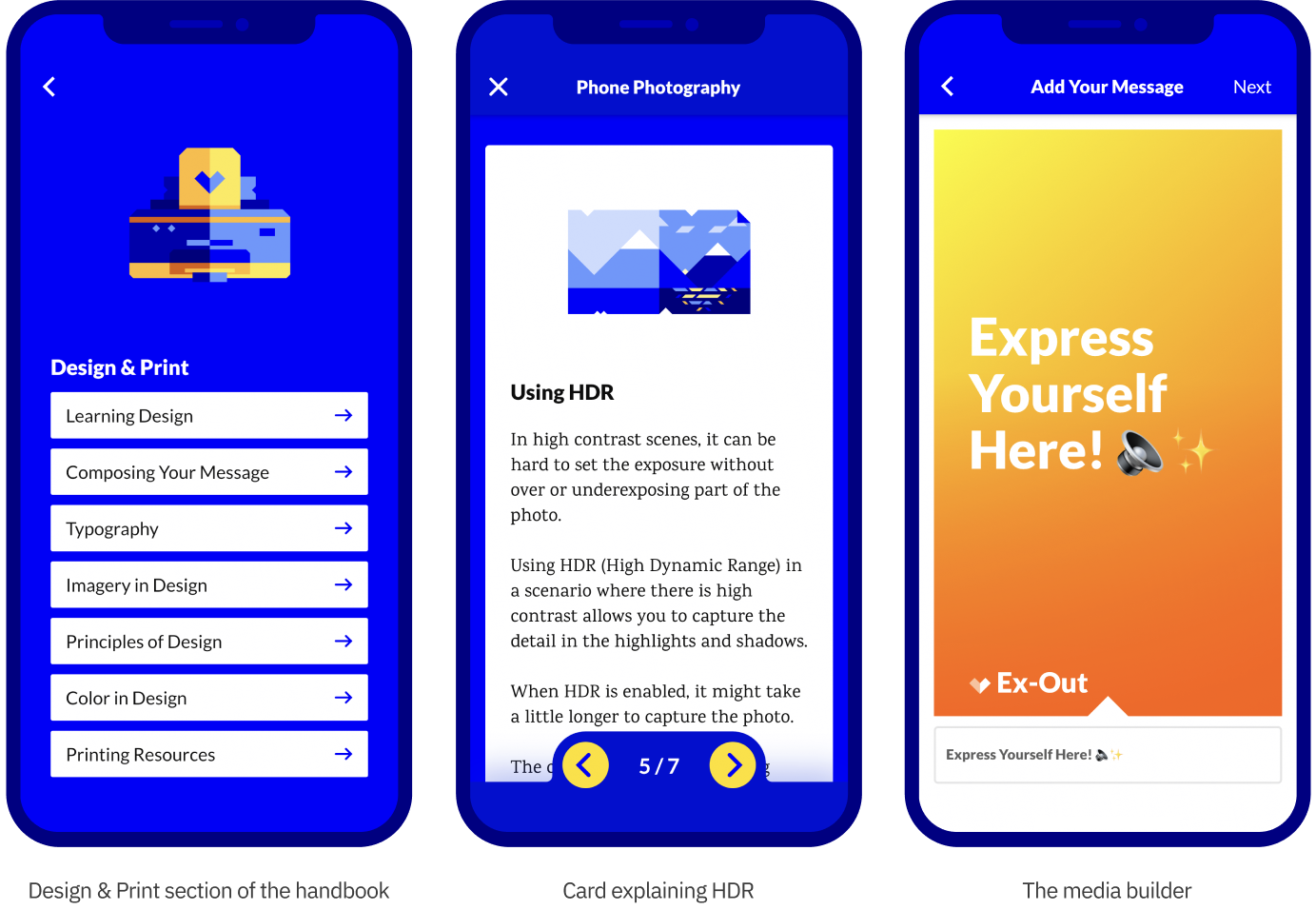
The app is comprised of a guide on how to educate yourself, make creative content, and spread your
message, as well as a media builder which creates shareable content with a customizable message, photo,
and color scheme. It's available on the App Store and Google Play.

The Ex-Out resource kit
Creative content and inspiring visuals help to express ideas, deliver an impactful message, and engage
and delight an audience. The resource kit gives a jumping off point to creating content and messages
that are meaningful and memorable.
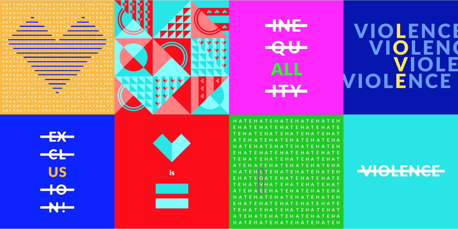
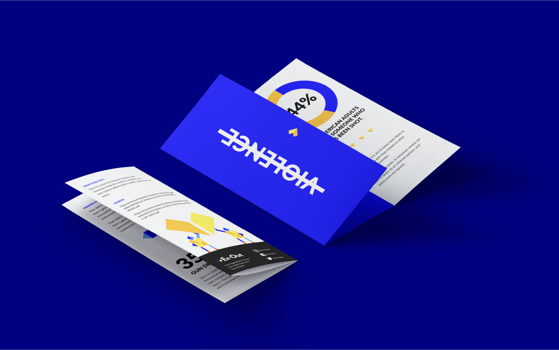
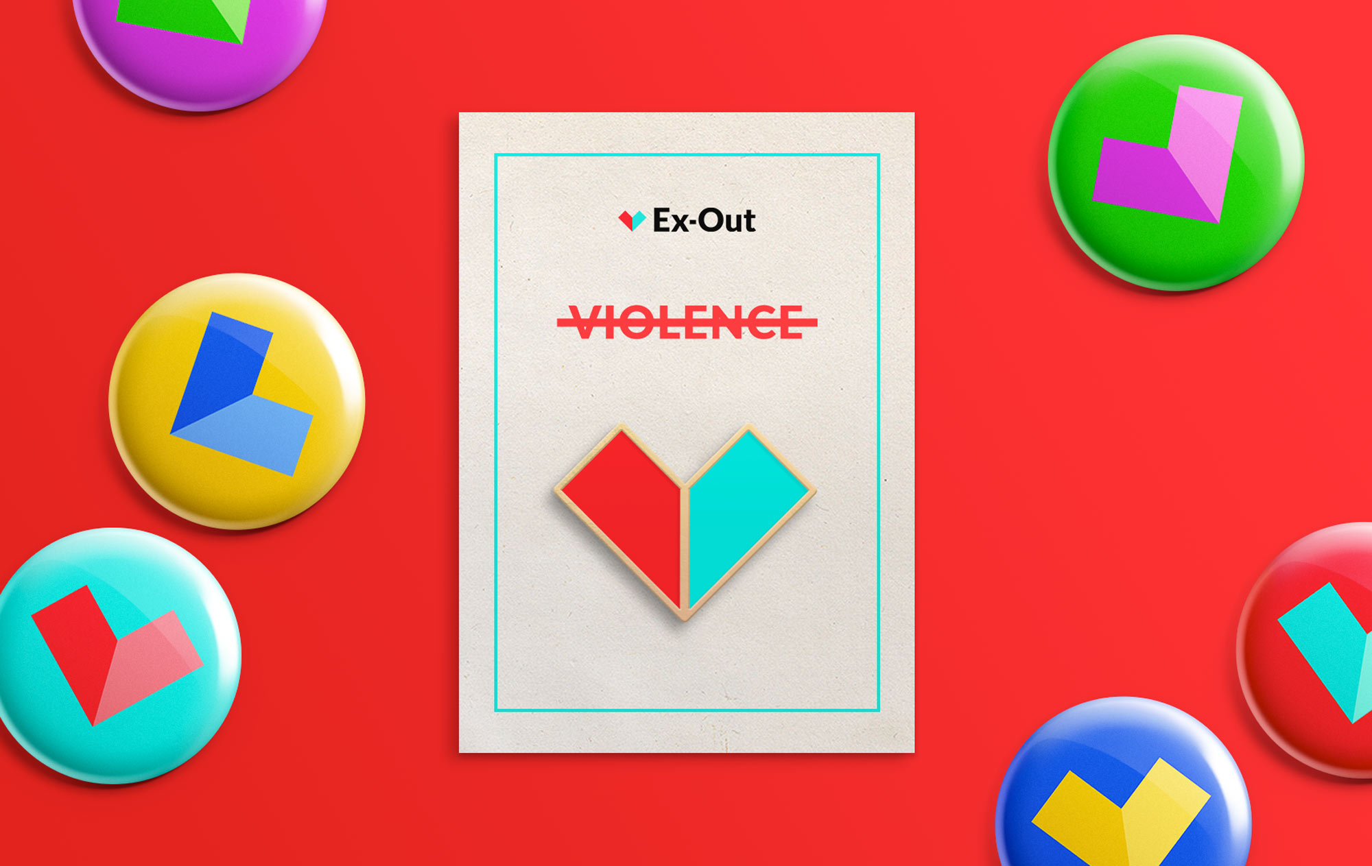
The resource kit is a collection of free for use assets, graphics, animations, and templates- it lives on
the Ex-Out site. Assets can be downloaded and used in
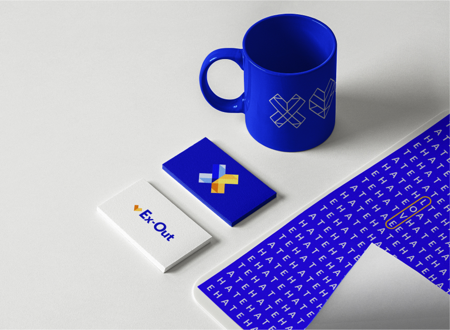
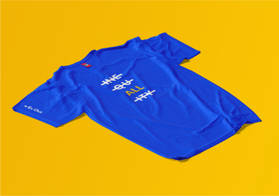
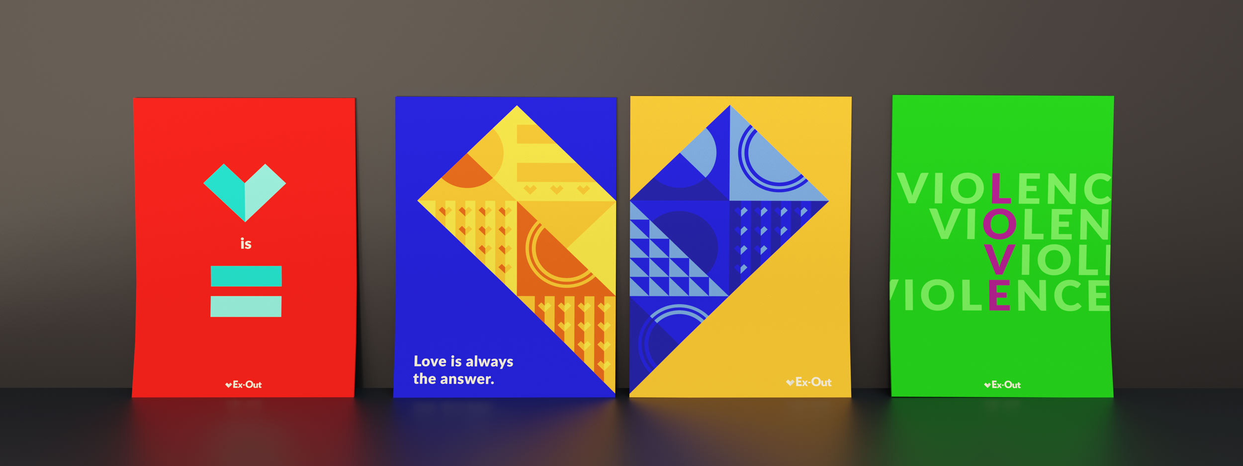
any desired application, from posters and stationery to apparel and stickers.


The design system
The Ex-Out design system is based on the embodiment of the brand: a heart. It is the basis for all human
life, so it made sense to build our brand on it.
The Ex-Out heart grid features a simple heart shape at the core, which can be combined and repeated to
become a complex grid suited for making illustrations and patterns.

Illustrations are an important part of the brand, and hundreds were made over the course of the project.
The assistance of the grid in making them allowed for a cohesive style across every illustration. Here
is a little taste of the illustrations spread throughout the app:

Another core part of the Ex-Out design system is the color opponent color scheme. Color opponents sit
opposite each other on the color wheel, for example, blue and yellow. The full Ex-Out color scheme uses
3 color opponents to create a harmonious color system. When combined digitally, the color opponents make
white, a symbol of unity and positivity.

About the team
The Ex-Out team is a small group of creators at the Rochester Institute of Technology. My roles on this
project included visual design, asset production, and illustration. Thanks for reading!


