Understanding how to be inclusive from a young age is instrumental in preventing bullying and promoting acceptance. This project aims to educatae kids in late elementary school to early middle school on the concept of inclusion through a print ABC book and an interactive museum experience.
Role: Designer, Illustrator
Time: Fall 2019, 14 weeks
Inclusion: Easy as ABC.
Concept & Research
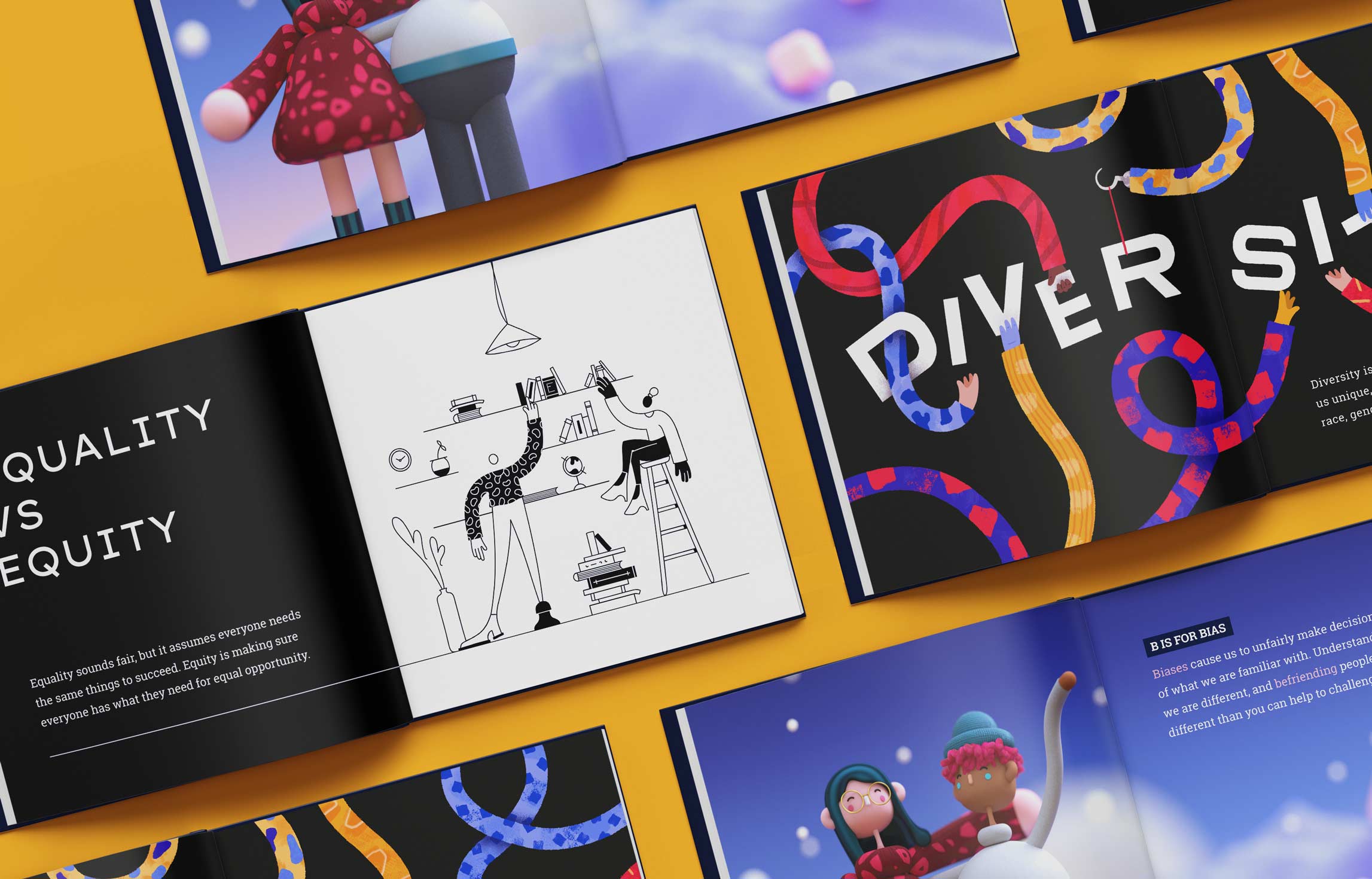
The team for this project consisted of nine designers, each responsible for their own three spreads. My three randomly chosen letters were B, D, and E. As a team we decided on the topic of inclusion, and did research to assign words to letters.
It was important that our book felt cohesive, especially with 9 designers contributing. We set restrictions on typography so it was unified throughout, but we allowed for diverse visual styles, making the end product an eclectic yet cohesive book.
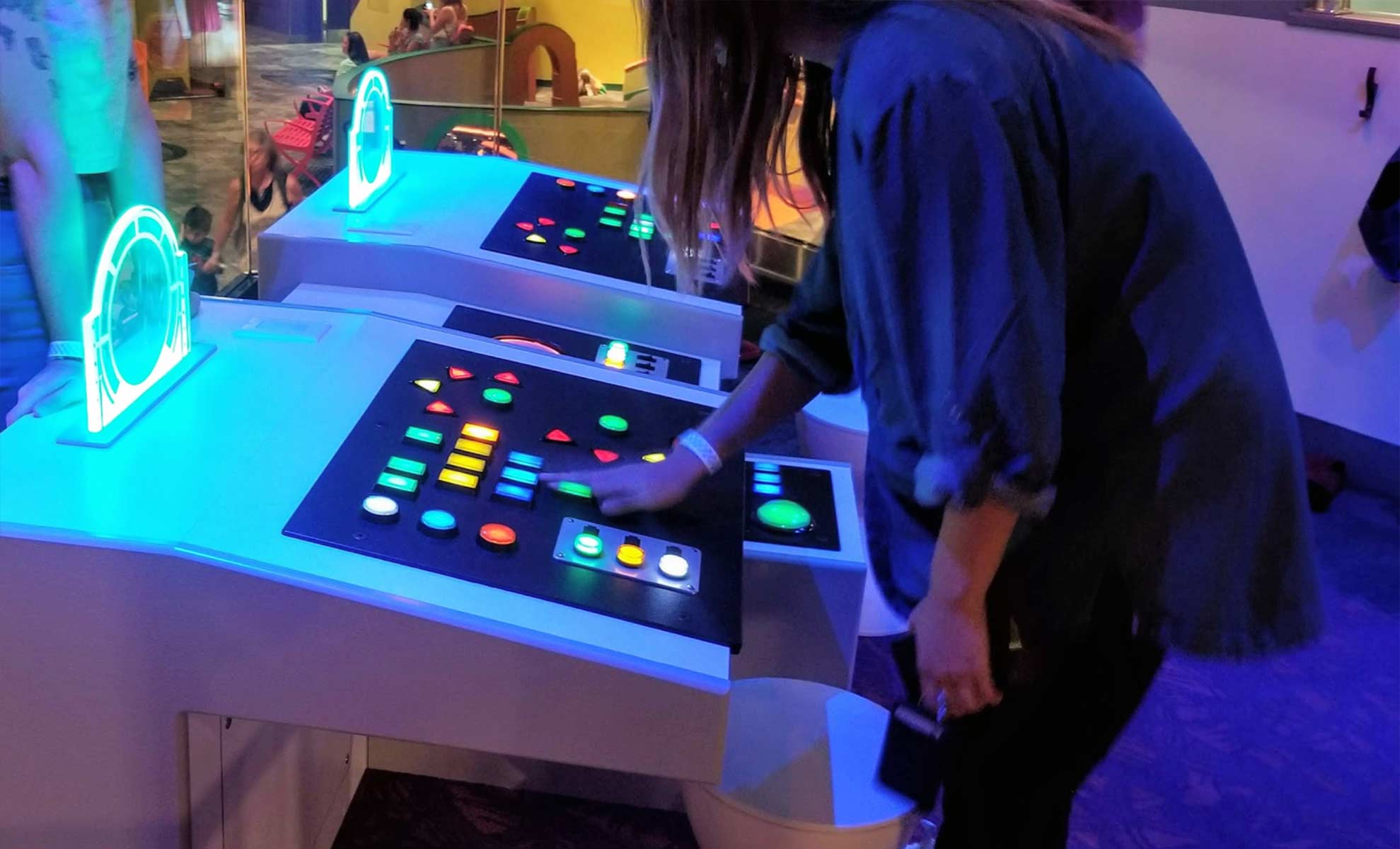
Our book is accompanied by a prototype for an immersive museum experience. To aid in our research and ideation for this, we visited the Strong Museum of Play to experience various interactions made for kids and to inform our decision making.
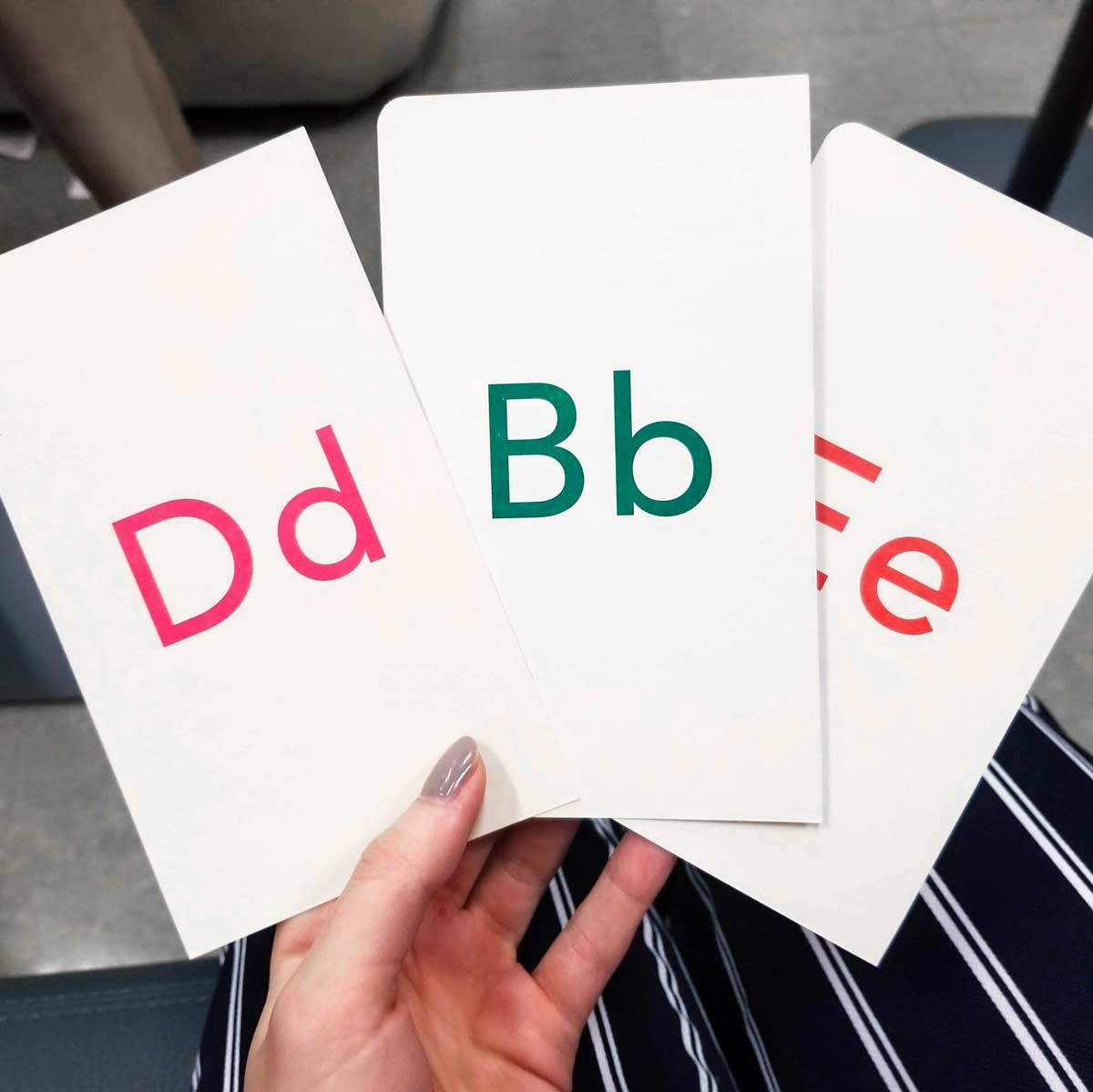
B is for Bias
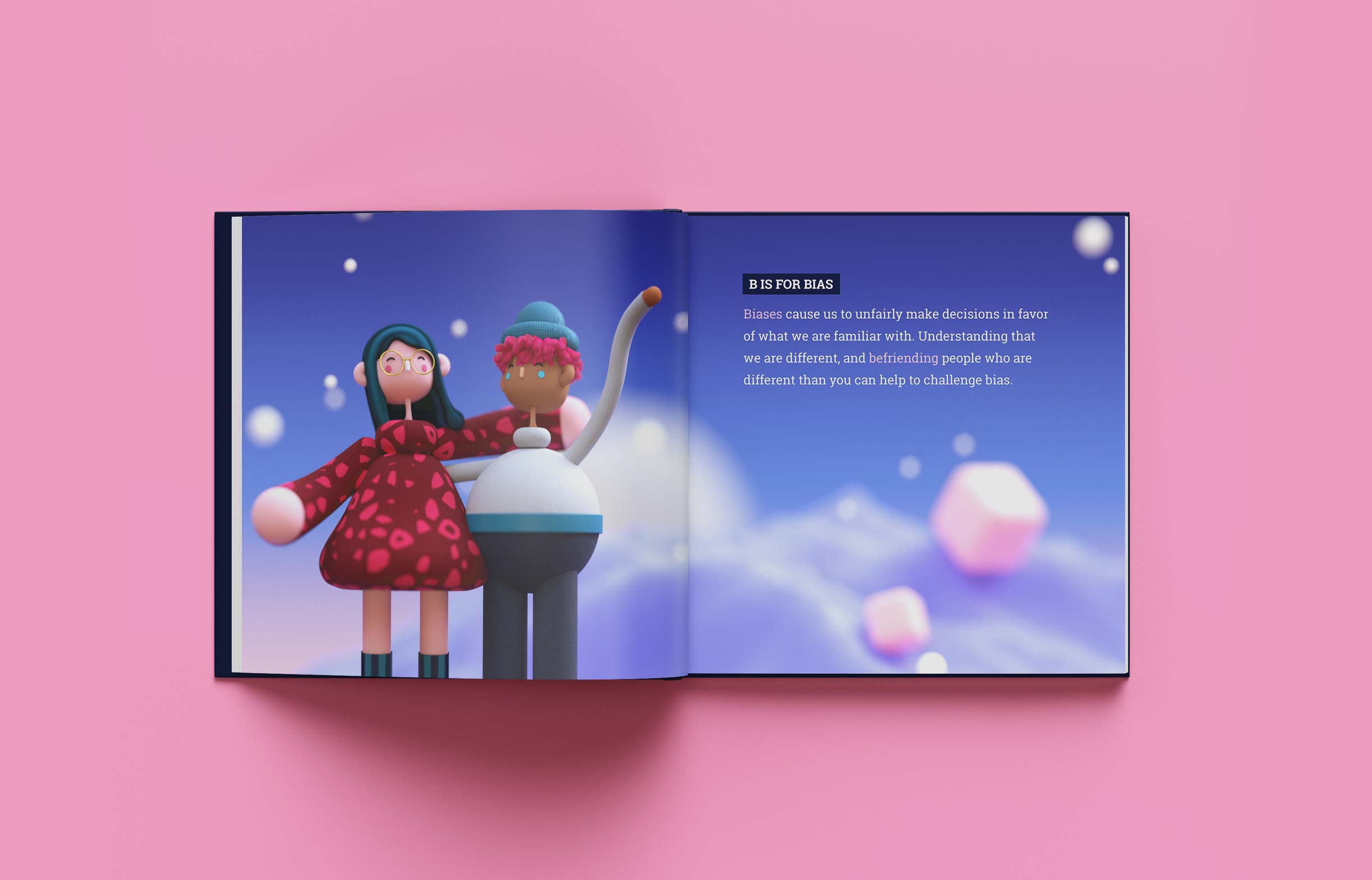
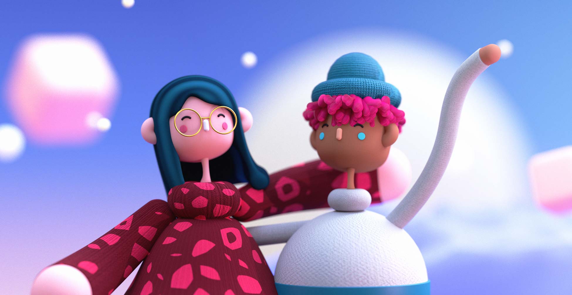
For this spread my goal was to communicate that although biases may alter our decision making, we can challenge our biases by befriending those who are different than you. I created two characters in C4D with different features being friendly to each other to place the focus on the benefit of challenging bias rather than on how bias negatively affects us.
The museum interaction model includes an iPad controller, where you can select a letter and interact according to the affordance for that letter. The controller would affect a large projection, where main content and animation is displayed. We prototyped this setup on a smaller scale using Principle and an iPad.
In the bias interaction, you can select different kinds of bias on the iPad to learn more about them, for example, confirmation bias, the halo effect, and self-serving bias.
D is for Diversity
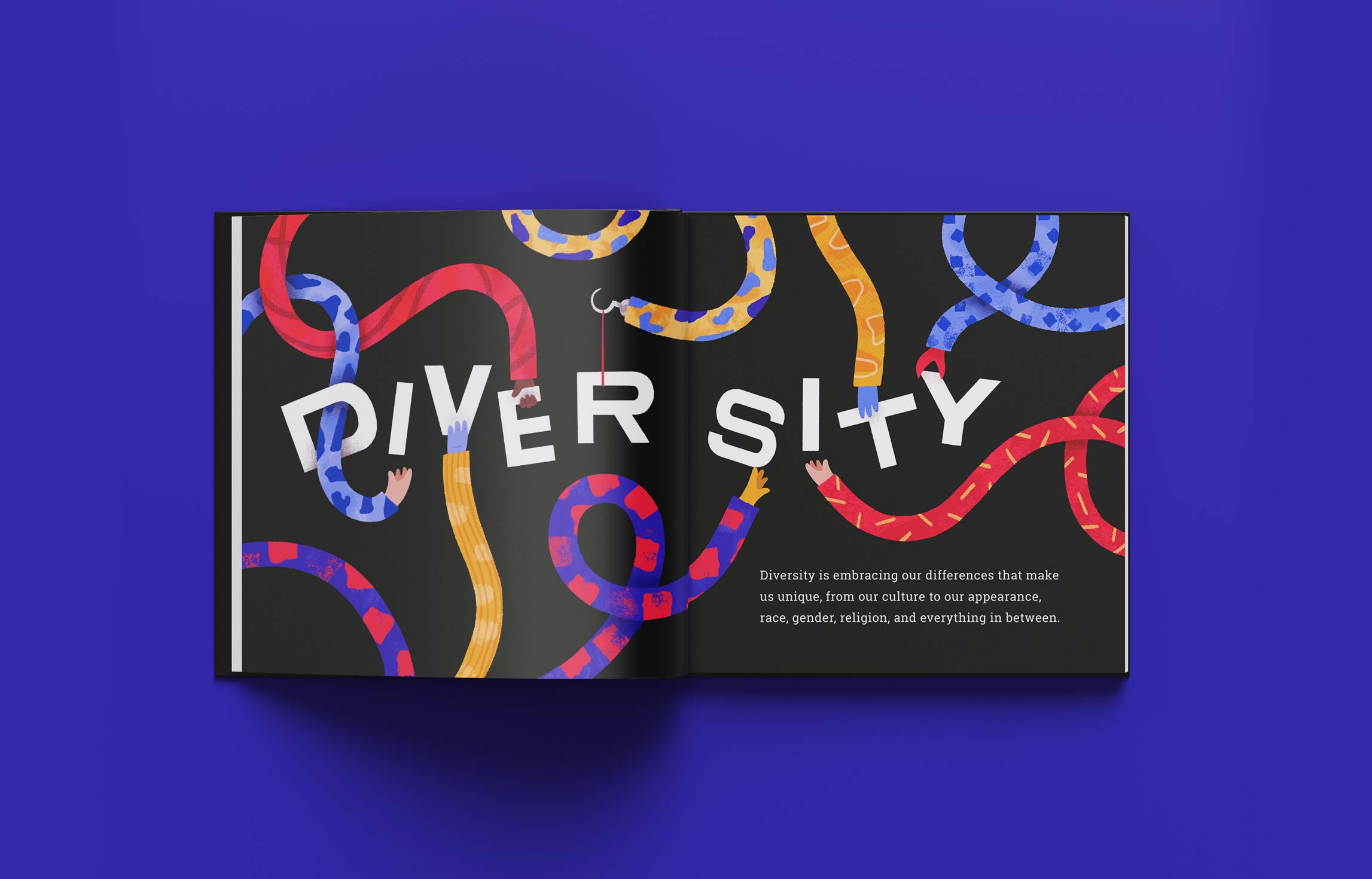
To communicate diversity in this spread, I used a variety of patterns and textures on the sleeves, of each arm along with a range of unique hands that work together to form the letters of "diversity". I chose to define diversity as embracing our diffeences that make us unique, to emphasize that our appearance, race, gender, etc. should not drive us apart, but bring us together.
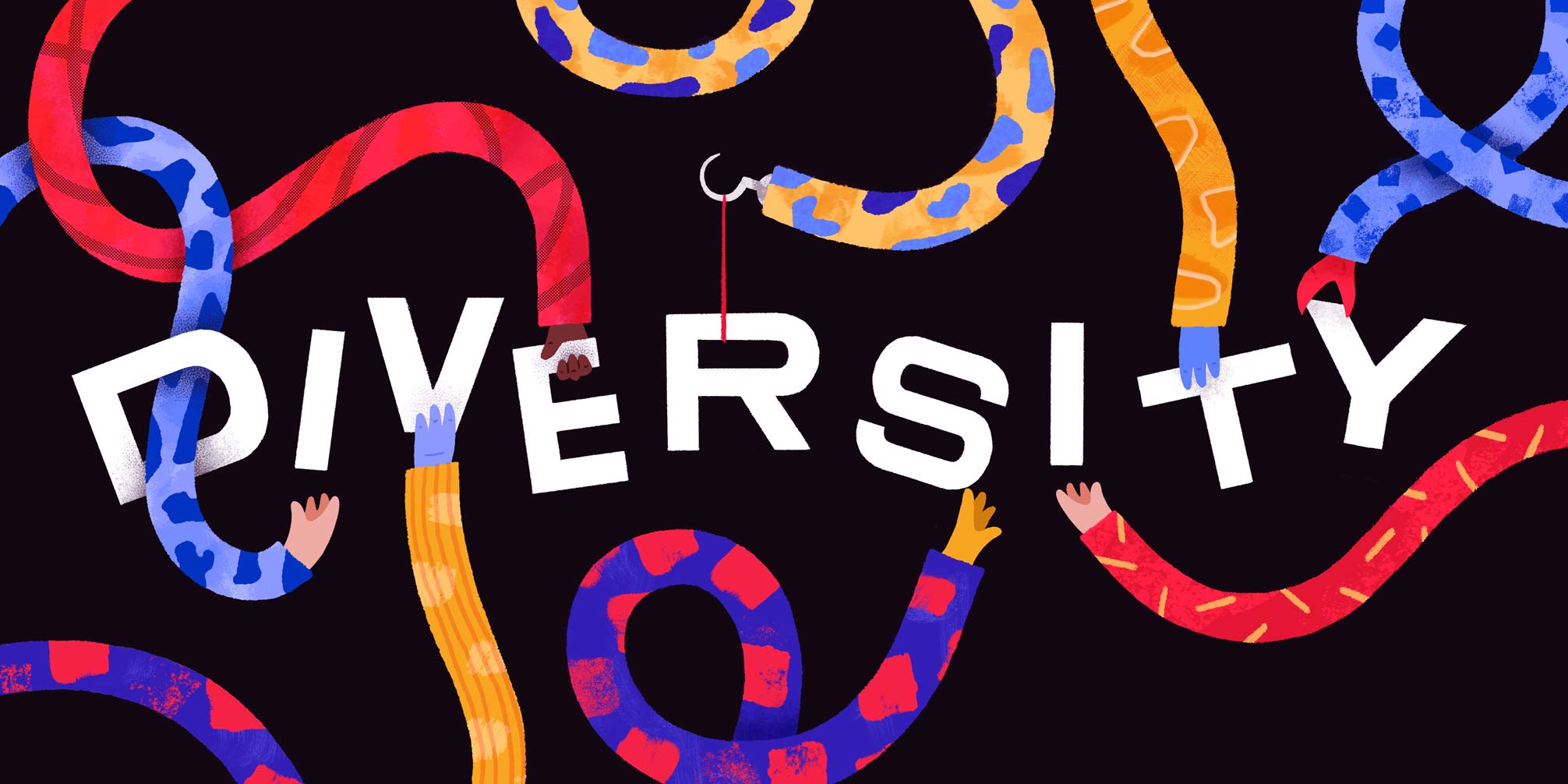

For the interaction, I split diversity up into 3 definitions: appreciating our differences, including everyone, and being unique. I made a corresponding animation for each, so when an option is selected on the iPad, an animation plays with each definition.
E is for Equity (vs. Equality)
This spread explains the difference between equality and equity, and shows an example of equity through two people having equal access to books on the top bookshelf.
I chose to explain equality as assuming everyone needs the same things to succeed, and equity as making sure everyone has what they need for equal oppotunity.
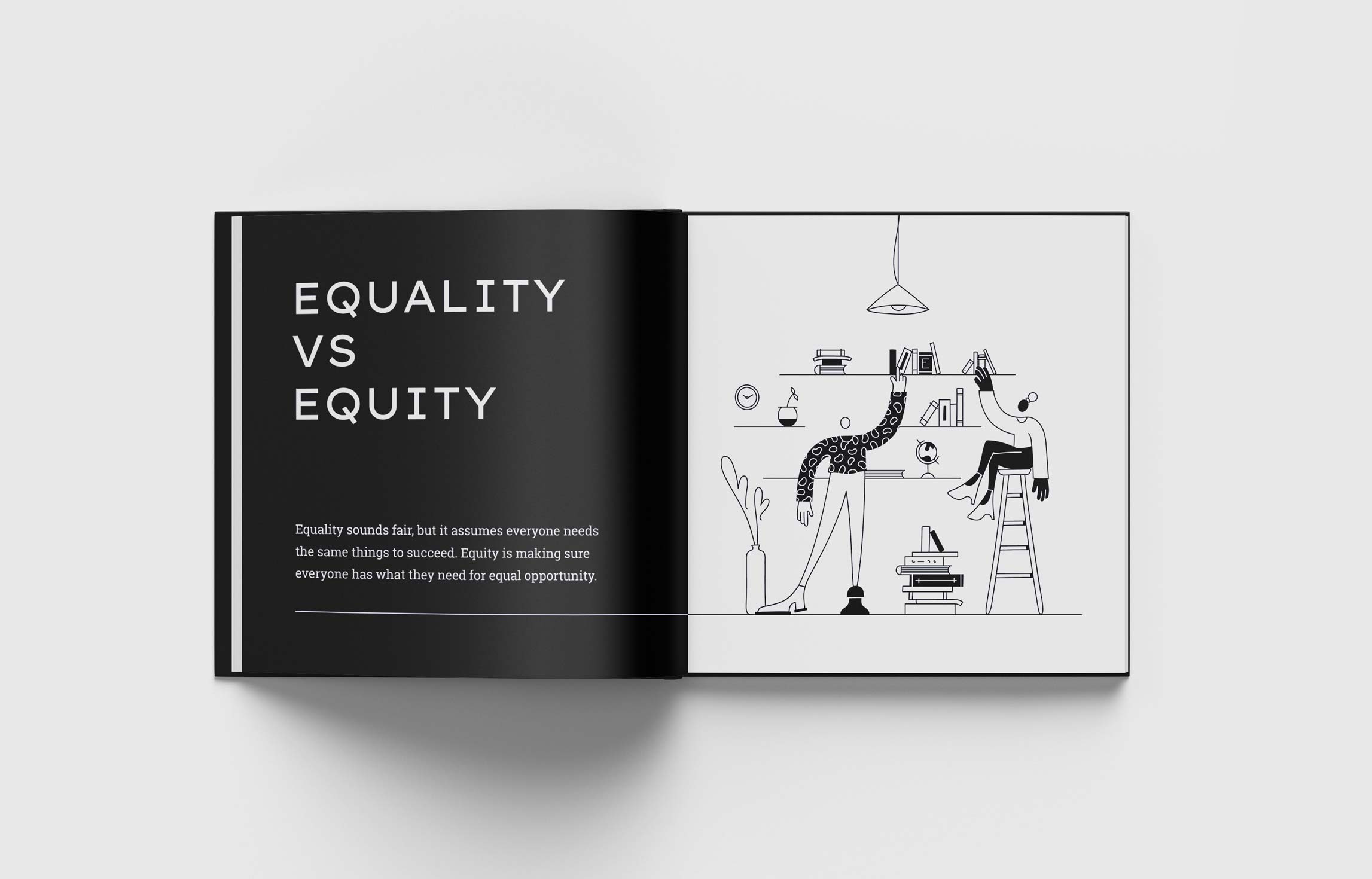
In this interaction, you can tap to animate between an example of equality and equity. In the equality example, the man and the woman are both given the same small stool, but the man doesn't need a stool, and the woman needs a taller one, which is shown in the example of equity.
Our Message
Our book communicates a message of inclusivity, not only through our words, but through our wide variety of visual styles. Bringing them together allowed us to create something complete and diverse, which reflects our concept overall.
Thanks for reading :) If you'd like to see the rest of the book, more of my process, or learn more about the project, you can view the course website or send me an email.